Journal of Consciousness Studies:2001:Ramachandran V S 2001:Synaesthesia- A Window Into Perception, Thought and Language
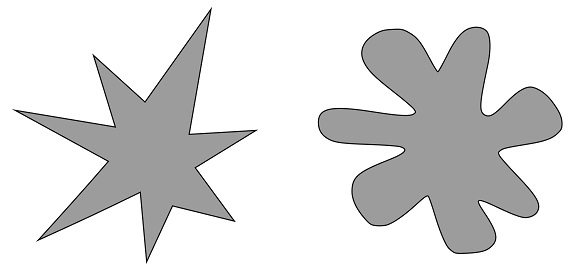
In short, the studies looked at the associations people make between the words Bouba and Kiki and the two shapes above. The vast majority, 98%, of people associate the word Kiki with the shape on the left and Bouba with the shape on the right for a couple of key reasons. Firstly, in auditory terms, the word Kiki sounds sharp and the shape on the left is sharp, contrarily Bouba sounds soft and the shape on the right is soft-edged.
Secondly, the letters in Kiki are sharp, the letters in Bouba rounded. The results are confounded for a small minority by the influence of language and where you come from. For example, Kiki is a first name or nickname in some countries, a town name in Iran and Poland, and the name of a radio station in Hawaii.
From personal experience, I use this effect as an exercise when conducting people management training for wine companies. There is always at least one person who thinks the opposite – that the shape on the left is Bouba. When asking these outliers why, they typically respond with an emotional association, such as Bouba sounds like an explosion (fear, anxiety, wonder) and the shape on the left looks like an explosion, whereas Kiki sounds cute and cuddly (security, affection, contentment, happiness) and they would rather cuddle the shape on the right!
'Wine is more complex, leading to more individualised cognitive associations'When asking participants if their presenter is a Bouba or a Kiki, the results are always more even because humans are much more complex than shapes, resulting in more potential associations. Occasionally there is also a participant who gets upset because they haven’t been told what Bouba and Kiki mean.
Why bring this up? In comparison to the shapes above, wine is more complex, which will lead to more individualised cognitive associations between what our customers physically experience on the palate and olfactory nerve, what they see (ie. the label), and what they hear (ie. from the person running a wine tasting).
Applying this to wine
The following literature review conducted by researchers at Oxford University looked at the crossmodal correspondences between ‘taste words’, ‘taste’, ‘colour words’ and ‘colours’.Flavour: 2015: Spence C 2015: On tasty colours and colourful tastes? Assessing, explaining, and utilizing crossmodal correspondences between colours and basic tastes
Key findings: Across multiple studies, involving multiple cultures there were the following correlations between taste words and colour words – ‘salt’ and ‘white’ and sometimes ‘blue’, ‘sweetness’ and ‘red’ and ‘pink’, ‘sourness’ and ‘green’ and ‘yellow’, and ‘bitterness’ with ‘brown’, ‘black’ and ‘purple’. However, Chinese people in one study did not associate ‘salt’ with ‘white’. The available studies only looked at basic tastes and did not look at colour construction as a mental image after actual tasting.
Coming back to Bouba and Kiki, would you say a typical Sauvignon Blanc is the shape on the left or the right? Bouba or Kiki? What about a Viognier made from very ripe grapes?
What if the shapes above were coloured red and pink respectively? In this case trying to apply Sauvignon Blanc and Viognier to these new, coloured shapes, would lead to a mental conflict for most people for two main reasons. Firstly, the visual colour of these wines can range from pale straw to perhaps orange in the case of very ripe Viognier, but red or pink? Most would assume there was something wrong with the wine!
Secondly, as mentioned above, there is the potential for tasting in colours. For most of us, perhaps not as in the extreme case of Synaesthesia where there is a crossing over of the senses in the ‘wiring’ of the brain (see the paper below), but in the metaphorical/conceptual/experiential sense – such as ‘I associate that taste with yellow or green coloured fruits’ or ‘that wine was so acidic it was painful and I am seeing red’.
Scientific American:2003:Ramachandran V S 2003:Hearing Colors, Tasting Shapes
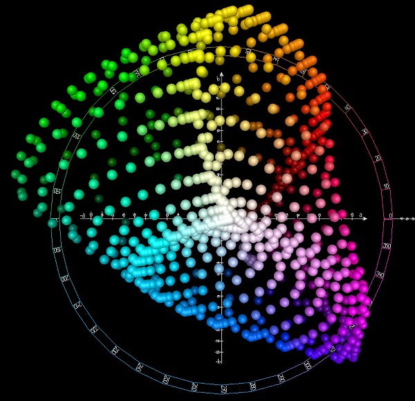
So give it a try! Where would you place a typical Sauvignon Blanc or Viognier wine on the CIELAB colour scale above, not by its visual colour but via the other senses? Try this also by tasting a wine blind and comparing the colour you picture/feel in your head with the actual wine colour when it is revealed.
Conflcit of the senses
The implication of taste-colour interactions for winemakers is that a conflict of the senses may affect a consumer’s perception of wine harmony and hedonic pleasure. For example, a lovely looking pink rosé wine would create an expectation of sweetness, but what if the taste was more ‘acidic’ and created a mental image of ‘green’ than ‘sweet’ and ‘pink’. Or more ‘bitter’ and ‘brown’ than ‘sweet’ and ‘pink’?'If the tasting room is extremely white, will this lead to more perception of saltiness?'The implications for designers of tasting rooms may be similar. If the tasting room is dominated by wood, does this result in tasters perceiving more bitterness in wine? If the tasting room is extremely white, will this lead to more perception of saltiness?
It would be good to see some more wine research conducted on the two speculations above, particularly into the interaction between actual taste and mental colour imaging.
James Wright is an international viticulture and management consultant and author of www.vitisynth.com and the newsletter VitiSynthesis.
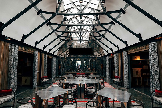
What have they done at Napa’s newest tasting lounge?
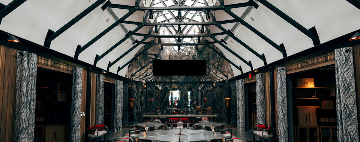
Napa Valley’s newest tasting lounge – at The Prisoner Wine Company, part of Constellation Brands – replicates the dark and edgy vibes of its flagship bottle and eye-catching Francisco de Goya label. It features vaulted ceilings with a massive skylight, living and dining-room style tasting room, open-view kitchen and a private tasting gallery called The Makery that features the work of 10 Northern California artists. A reclaimed diesel tank serves as a chandelier, and everything is black, metal or grey with splashes of red. The alcoves in The Makery (above) showcase work from local artisans and craftspeople, including handmade jewellery, wine-infused soaps, and pottery.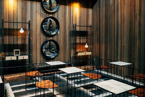
Custom cage seating for one-on-one tasting and pairing experiences in The Prisoner Wine Company tasting lounge. Photo: Matt Morris for TPWC
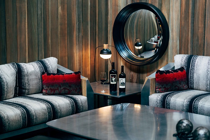
Lounge couches in The Prisoner Wine Company tasting lounge. Photo: Matt Morris for TPWC
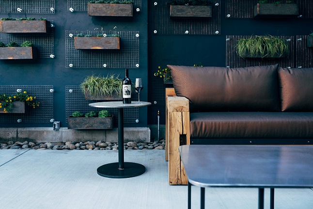
Outdoor seating in The Yard of The Prisoner Wine Company tasting lounge. Photo: Matt Morris for TPWC
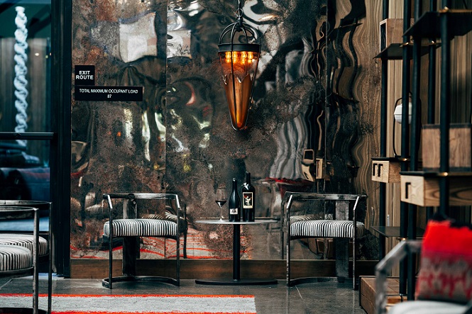
Visitor seating in The Prisoner Wine Company tasting lounge. Photo: Matt Morris for TPWC





.png)
