Once considered a static medium, wine labels are now at the forefront of contemporay design, technology, and transparency.
Once the realm of cursive fonts and embossed paper, contemporary wine labels have become a mini universe. A number of seismic shifts in the industry – technological, cultural, and commercial – have upended the mid-20th-century paradigm of conveying storied prestige (at the premium level) in favour of a far broader range of priorities and consumer expectations. Where once the chief purpose of a Krug label, for example, was to convey heritage and trigger instant recognition, today it must perform across multiple contexts: from screen to shelf, with a digital ID containing a wealth of background information on the wine and harvest. The rules of the game have changed – and there is no going back.
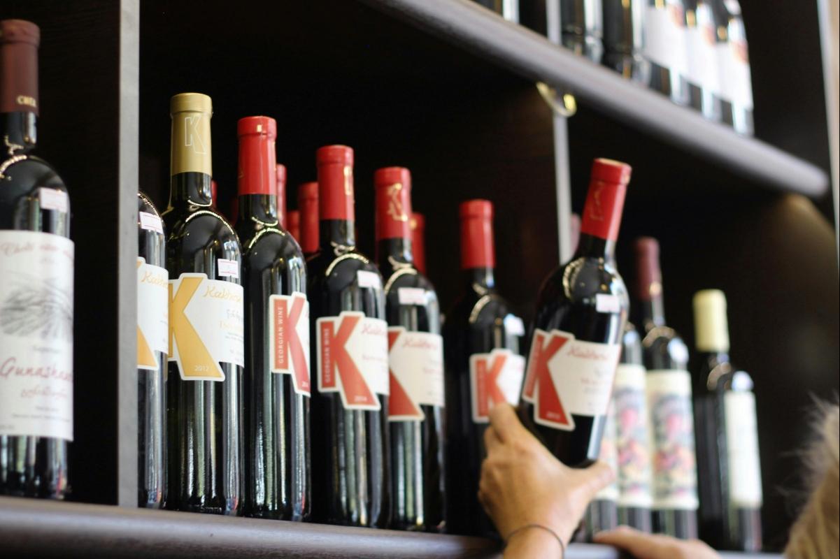
Much of the change, of course, has been driven by the rise of e-commerce: the migration of the bottle from retail shelves to digital storefronts. "Having a bottle that shines both on the shelf and in e-commerce comes down to visual hierarchy and brand clarity," observes Scout Driscoll, founder and CEO of design agency VINT. "Our wine label design process always starts with one question: would you recognise this bottle instantly on a tiny screen? Ask yourself, does your packaging stand out in a crowded aisle or a mobile feed? Is there a visual hallmark that says 'this is us'?"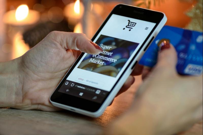
Indeed, what once needed to capture the eye at close distance must now perform at thumbnail scale on a phone. "Many wineries lean into regional authenticity, echoing their AVA's traditional look," she adds. "But in digital spaces, distinction matters just as much as heritage. Strong wine branding balances both authenticity and visibility."
According to Rowena Curlewis, CEO of Denomination: "Without the ability to communicate paper textures, finishes and embellishments, designers need to communicate quality in a way that stands out amongst the other 30mm images online." In other words, the online environment has profoundly altered the semiotics of quality.
She continues: "This is an environment where detailed crests and filigree can blur into nothing on tiny screens. So in general, quality cues are changing to favour simpler and stronger imagery and considered typography – and this is happening at all price points." Curlewis highlights the recent example of California-based brand Louis M. Martini - its new label features an illustrated engraving of a red gryphon – as a redesign that "translates far better online than its previous design."
Design through committee
Yet communicating notions of heritage – and especially authenticity – remain top priorities for many wine brands today. The challenge is that authenticity – long conveyed through French-style script and stately chateaux – increasingly has to be reimagined for a generation of consumers with radically different priorities to their parents.
"Quality today is personal. Modern consumers don't just want to know that something is high quality, they want to feel that it was made for them," explains Driscoll. "For example, we recently rebranded a 40-year-old winery by focusing on how the wine lives in a modern home surrounded by contemporary design. We know where that customer shops, dines, and finds inspiration, and we design to resonate in that lifestyle."
Nowhere is this tension between continuity and adaptation more evident than in legacy brands undergoing redesigns. Knappstein Wines in Australia's Clare Valley recently reworked its labels to "better reflect the brand's evolution; balancing its rich Clare Valley heritage with a renewed focus on engaging a more modern wine audience," explains marketing specialist Xavier Wills.
"Market insights showed that younger consumers were increasingly drawn to brands that tell a story visually, with authenticity expressed through design simplicity and texture rather than traditional cues alone," he reveals. The new design, according to Wills, showcases "cleaner lines, refined typography, and a more confident use of space" - the overarching goal being to bridge generations without alienating traditionalists.
"Since launching the refresh, we've observed a noticeable lift in both customer engagement and brand perception," he says. He also believes that the redesign has "contributed to stronger shelf presence and improved recall in retail settings," reinforcing the value of balancing evolution with heritage. Perhaps wineries can have their cake and eat it after all?
Meanwhile, at California's Barra of Mendocino, sustainability and storytelling were the twin forces behind its Reserve label redesign. "Our commitment to organic farming was a pivotal driver in the aesthetic development of the new label," says co-owner Shelley Maly. The team aimed for a design that "communicated authenticity, environmental stewardship, and rootedness," with an historic oak tree on the back seal conveying resilience, while the inclusion of birds in flight was meant to highlight an "ecosystem balance and habitat creation that are hallmarks of our organic farming methods."
But most importantly, the redesign – developed through a democratic process involving focus groups – delivered a 25% uplift in case sales across all channels, according to Maly. And while it may be overstating it to claim this is a fool-proof panacea for driving sales, Barra's experience would suggest that visual storytelling can have real impact when sustainability is integrated at the design level.
A new frontier
However, contemporary aesthetics are only part of this evolving story. A growing number of producers are treating labels as functional interfaces – gateways to transparency, engagement, and fraud prevention. The use of QR codes, near-field communication (NFC) chips, and blockchain verification is increasingly common among top-end Bordeaux estates, including Chateau Latour, Le Pin, Palmer, and Angelus. These technologies, primarily relevant to the luxury sphere, also allow producers to record immutable data on origin, vintage, and custody, ensuring that a bottle's entire journey can be verified. "Installing the Krug ID was very much a personal decision," Margareth Henriquez, erstwhile Krug president, told me in 2018.
"The idea came to me during a tasting with one of our growers: I was fascinated by the selection process and I wanted to share at least some of the founding elements of each bottle of Krug with a wider audience - it fosters stronger brand identity and reinforces trust in the brand. And we live in an era of information. Krug had to adapt."
As Henriquez once underlined, the implications for trust and storytelling are profound. Technological innovation is transforming a static object into a dynamic interface; for wineries, these tools can help labels become both a marketing platform and a guarantee of authenticity – one that merges the tactile and digital worlds. Moreover, as online retail expands, it is not inconceivable that mid-tier brands will adopt digital tags to reassure a tech-savvy customer base of their origin and sustainability claims.
In the 20th century, labels were primarily tools of ornamentation and recognition. Today, they are becoming narrative systems, communicating provenance, values, and now, via digital tech, proof of origin. For an industry built on storytelling, label modernisation has the potential to bridge heritage and innovation – a vital evolution in our online age.

Get expert insights, weekly highlights, and exclusive stories from the world's most trusted wine competition.